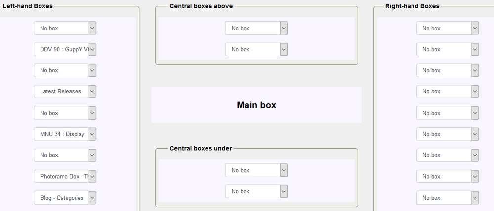
Display grid
Displaying boxes on a page :
The integration of Bootstrap in GuppY modifies the way to position the boxes on a page, no more question of percentage, now it will be columns!
The grid is composed of columns (.col) and rows (.row), a maximum of 12 columns in a row, and fully responsive. In no case can you exceed 12 in width but you are not obliged to use all 12 columns.
With a few screenshots, it will be more understandable:

Here is a line of the Bootstrap grid with its 12 columns
Let's now look at the concrete application for box positioning and display on a GuppY 6 page, starting at the top of the page:

The positioning of the boxes at the top
Note: A novelty "Empty free box", this empty box is used to center the middle box or is used to keep a selected box in its place.
Not all the lines are 12, but none of them protrude!
Let's go now to the Home page, you go to Admin/Config/Home/Blog :

The positioning of the boxes on the home page
Important: For the demo base, we have chosen the option "without side boxes", this allows us to have the whole width, that is 12 columns,
If you have a side column, it will be 3 columns used, 2 side columns it will be 6 columns used, you will have 9 or 6 columns left,
The width of a side column is 3 columns and cannot be changed!
Without forgetting the Blog part, you select the boxes of the blog on the left or on the right according to your choice.
For the central part:
if you use a side column, you have a maximum of 9 columns for the central boxes,
if you use two side columns, you have a maximum of 6 columns for the central boxes,
if you do not use side columns, you have all 12 columns.
It's up to you to choose the layout of the boxes that suits you for the presentation of your site.
The central boxes above and below are the same width as the main box.

The positioning of the boxes for the central part
Reminder: The width of a side column is 3 columns and cannot be changed!
The boxes at the bottom of the page to finish:
Always the same principle with 12 columns per row, to be used all or in part.

The positioning of the boxes at the bottom
On the second row, we use a 9-column slot and a 3-column slot,
On the third row are placed four places of 3 columns, with a customization to air the whole and you have the bottom part of this skin.
In summary:
On a line, you can never exceed 12 columns, whether at the top, in the middle or at the bottom, the side columns are fixed to 3 columns.
Now you can move on to the configuration of the pages of your site !!!
